



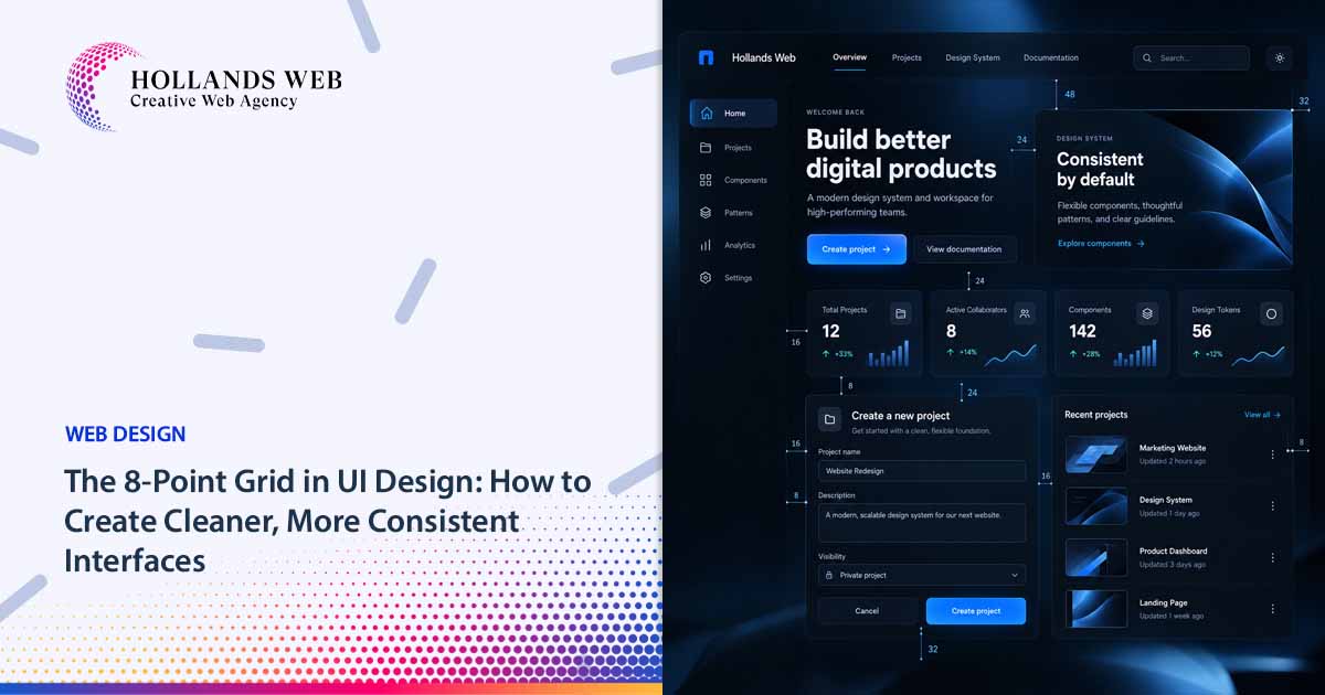


Some interfaces feel slightly wrong even when the typography is good, the colors work, and every individual component looks polished.
Often, the problem is spacing.
One card has 21px of padding. Another has 26px. A form uses a 14px gap between fields, while a similar form elsewhere uses 18px. Sections that should feel equally important have noticeably different amounts of whitespace.
None of those decisions is disastrous on its own. Together, however, they create visual noise.
An 8-point grid in UI design solves this problem by replacing repeated spacing guesses with a small, predictable system. Instead of inventing a new value every time something needs more or less space, designers work from a defined spacing scale.
The important part is understanding what the system actually means.
An 8-point grid is not a rule that every dimension in an interface must be divisible by eight. It is a framework for creating consistent relationships between elements.
That distinction is what makes the system useful rather than restrictive.
What Is an 8-Point Grid in UI Design?
An 8-point grid is a spacing and sizing system in which many interface dimensions are based on increments of eight.
A simple sequence might look like:
8 → 16 → 24 → 32 → 40 → 48 → 64 → 80 → 96
Designers can then use those values for decisions such as component padding, layout gaps, section spacing, card spacing, navigation spacing and other structural relationships.
A smaller 4px sub-unit is often useful when the interface needs finer adjustments.
For example:
| Relationship | Example value |
|---|---|
| Very tight internal spacing | 4px |
| Small gap | 8px |
| Related elements | 16px |
| Component padding | 24px |
| Larger component separation | 32px |
| Section spacing | 48–96px |
These are examples of a system, not universal specifications.
A compact dashboard may need tighter spacing than a marketing website. A mobile interface may use different section spacing from its desktop version. A data-heavy enterprise application may deliberately prioritize density.
The objective is consistency in the relationships, not obedience to a particular number.
“8-point” does not mean CSS pt
There is another useful distinction for web designers.
The word point in “8-point grid” describes the design-system increment. It does not mean you should write spacing using the CSS pt unit.
For a web interface, the system will commonly be represented using CSS pixels, rem-based tokens, or another implementation abstraction. Android systems frequently describe dimensions using density-independent pixels (dp). Material Design, for example, historically documented an 8dp baseline grid while using 4dp for certain finer alignments. Material Design
Think of 8 as the rhythm, not as a requirement to use one particular technical unit everywhere.
An 8px Rhythm Is Not the Same as “Everything Must Be Divisible by 8”
This is one of the most common misunderstandings about the 8-point grid.
A spacing system might strongly prefer values such as:
8 / 16 / 24 / 32 / 48 / 64
That does not mean every number appearing in the interface must belong to that sequence.
Typography is an obvious example.
A design could legitimately contain:
- 14px text
- 18px text
- 20px icons
- 1px borders
- 2px focus outlines
- a 44px or 48px interactive target
without somehow “breaking” the spacing system.
Typography has its own metrics: font size, line height, cap height, x-height and baseline relationships. Borders have their own requirements. Icons may have optical rather than purely mathematical alignment. Accessibility can impose minimum dimensions that matter more than keeping everything on a strict numerical grid.
Material Design itself illustrates the nuance: its earlier guidance used an 8dp baseline grid for components while also using a 4dp grid for iconography and typography-related alignment. Material Design
A practical interpretation is therefore:
Use 8px as the primary rhythm for structural spacing, with 4px available for finer relationships when necessary.
That is much more useful than trying to force every measurement into multiples of eight.
Why Do Designers Use an 8-Point Grid?
The main advantage of an 8-point grid is not that eight has some special visual property.
The advantage is constraint.
Without a spacing system, every layout decision becomes a new decision. Should the gap be 17px? 20px? 22px? Should this card use 25px padding because it “looks about right”?
Once the system has a defined scale, the question changes:
Is this a small, medium or large relationship within our system?
That change produces several practical benefits.
More consistent interfaces
Repeated components begin to share the same spatial logic.
Cards belonging to the same family can use the same internal padding. Form groups can follow predictable vertical spacing. Modal content can use the same spacing tokens as other containers.
Consistency makes the product easier to extend because new screens do not require reinventing basic layout decisions.
Faster design decisions
A spacing scale reduces low-value experimentation.
Instead of comparing 19px, 21px and 23px repeatedly, the designer may decide between space-16 and space-24.
That does not remove judgment. It focuses judgment on the relationship rather than the arbitrary number.
Cleaner designer-to-developer handoff
A spacing system becomes especially valuable once it exists in both design and code.
Instead of a Figma file containing dozens of unrelated spacing measurements, both teams can work with shared tokens such as:
space-xs  = 4
space-sm  = 8
space-md  = 16
space-lg  = 24
space-xl  = 32
space-2xl = 48
space-3xl = 64
The exact naming convention matters less than maintaining the same semantic system across the design file and frontend implementation.
Stronger visual rhythm
Consistent spacing helps communicate relationships.
Elements placed close together tend to feel related. Larger gaps can separate components, groups or sections.
The grid therefore contributes to visual hierarchy without requiring extra borders, backgrounds or decorative separators.
That relationship is important: spacing should communicate structure, not simply make a screen look “clean.”
Easier scaling
A product containing three screens can survive some inconsistent spacing.
A product containing dozens of components across hundreds of screens becomes much harder to maintain that way.
The value of a spacing system increases as the product grows because designers and developers can compose new interfaces from established rules rather than local decisions.
Where Is the 8-Point Grid Used?
The system can influence almost every level of interface composition, but it should be applied according to context.
Common uses include:
| UI area | Example |
|---|---|
| Card padding | 16px or 24px |
| Card-to-card gap | 16px or 24px |
| Button horizontal padding | 16px or 24px |
| Icon-to-label spacing | 8px |
| Form group spacing | 16px or 24px |
| Navigation spacing | 8px, 16px or 24px |
| Modal padding | 24px or 32px |
| Grid gutters | 16px, 24px or 32px |
| Section spacing | 48px, 64px or 96px |
| Small label relationships | 4px or 8px |
These values should not be copied blindly.
Material Design, for example, has documented many layouts using values such as 8dp, 16dp and 24dp while varying margins and gutters according to the screen and component. Its responsive guidance explicitly allowed different margin and gutter values rather than requiring one universal measurement. Material Design
The lesson is broader than Material Design itself: a spacing system should define a vocabulary, not a single spacing value.
Build a Practical Spacing Scale Instead of Using Every Multiple of Eight

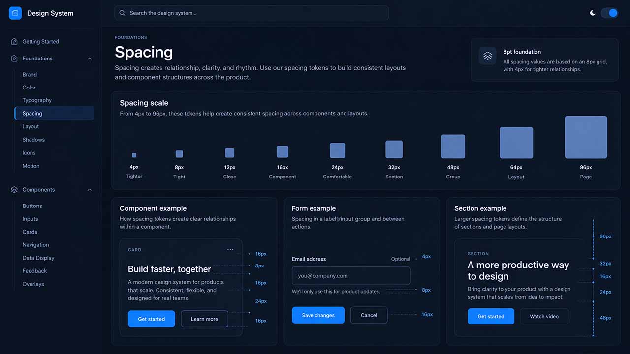
A mathematically pure 8-point scale could contain:
8, 16, 24, 32, 40, 48, 56, 64, 72, 80, 88, 96…
That does not mean your design system needs all of them.
Too many spacing tokens recreate the original problem. Designers once again have to choose between several nearly identical values.
For many websites and digital products, a practical starting scale could be:
4 / 8 / 12 / 16 / 24 / 32 / 48 / 64 / 96
Here, 4 and 12 allow finer spacing while the larger values maintain the broader 8px rhythm.
The most frequently used values may eventually be something closer to:
8 / 16 / 24 / 32 / 48
with 4px reserved for very tight relationships and 64–96px for larger layout spacing.
Name spacing tokens by purpose or scale
A frontend implementation could use numerical tokens:
--space-1: 4px;
--space-2: 8px;
--space-3: 12px;
--space-4: 16px;
--space-6: 24px;
--space-8: 32px;
--space-12: 48px;
--space-16: 64px;
--space-24: 96px;
Another design system might prefer semantic aliases:
--space-tight: 8px;
--space-default: 16px;
--space-component: 24px;
--space-section-sm: 48px;
--space-section-lg: 96px;
Neither naming system is inherently better.
Numerical scales tend to be flexible. Semantic tokens communicate intent more clearly. Larger systems sometimes use both: primitive spacing tokens underneath and semantic aliases above them.
The important part is that the Figma library and production code describe the same system.
8-Point Grid vs 4-Point Grid: Which Should You Use?
The 4-point grid and 8-point grid do not have to compete.
A practical design system can use:
4px as the smallest spacing unit + 8px as the primary visual rhythm.
That combination gives designers enough precision for compact relationships without allowing the spacing scale to become arbitrary.
Consider a form field.
You might use:
Label → input:          8px
Input → helper text:    4px
Field group → group:   24px
The 4px value creates a subtle relationship between an input and its supporting text. The 24px value clearly separates one field group from the next.
This is more meaningful than trying to make every gap identical.
When a 4px base is particularly useful
Smaller increments become useful in:
- dense enterprise applications
- data tables
- compact navigation
- icon-and-label relationships
- helper text and validation messages
- component variants with different density levels
The danger is not using 4px.
The danger is allowing a fine-grained system to turn into dozens of values such as 6, 10, 14, 18, 22 and 26px without a clear reason.
How to Apply the 8-Point Grid to Real UI Components
The easiest way to understand the system is at component level.
Example 1: A card
Imagine a SaaS dashboard card containing an icon, heading, description and action.
A coherent spacing specification might be:
Card padding:                  24px
Icon → title:                  16px
Title → description:            8px
Description → action:          24px
Card → next card:              24px
Notice that not every space is the same.
The tighter 8px relationship tells the eye that the title and description belong together. The 24px gap before the action creates a stronger separation between information and interaction.
That is the real value of the grid: different spacing tokens can express different relationships while still belonging to one system.

Example 2: A button
Suppose a button contains a text label and leading icon.
You could define:
Icon → label:            8px
Horizontal padding:     16px
Its overall height, however, should not be dictated purely by grid aesthetics.
Interactive target dimensions also have accessibility implications.
WCAG 2.2’s Level AA Target Size (Minimum) criterion specifies a target of at least 24×24 CSS pixels, subject to defined exceptions such as sufficient spacing between undersized targets. W3C
Platform guidance can be more generous. Apple’s interface guidance, for example, recommends 44×44-point touch controls for its platforms. Apple Developer
This illustrates an important hierarchy of decisions:
Do not shrink an interactive target merely to preserve your preferred grid. Accessibility and platform interaction requirements come first.
Your visible icon might be 20 or 24px while its clickable area is considerably larger.
Example 3: A form
A registration form might use:
Label → field:               8px
Field → helper/error text:   4px
Field group → field group:  24px
Form → primary action:      32px
The spacing now describes hierarchy.
An error message remains visually attached to the field it explains. Separate fields have enough distance to be distinguishable. The primary action receives greater separation from the data-entry area.
Good spacing is therefore partly about information architecture.
Spacing Is Also a UX Signal
A spacing system should not be treated as a decorative finishing technique.
Whitespace helps indicate which objects belong together.
For example, imagine:
Product title
8px
Price
32px
Shipping options
The title and price are visually grouped. Shipping starts a new informational group.
Reverse those values and the implied structure changes.
This becomes especially important in dashboards, checkout pages, settings panels and forms where the user needs to understand groups quickly.
Consistent spacing reduces the number of additional visual devices the interface needs.
If every section requires a border, colored container and divider just to explain its structure, the spacing hierarchy may not be doing enough work.
Use the 8-Point Grid Responsively, Not Rigidly
A spacing system does not mean desktop, tablet and mobile layouts should use identical spacing.
Responsive design changes available space, density and layout structure.
A marketing section might use:
| Viewport context | Vertical section spacing |
|---|---|
| Desktop | 96px |
| Tablet | 64px |
| Mobile | 48px |
All three values belong to the same spacing scale.
The system remains consistent while the layout adapts.

Components can also change spacing
A desktop card could use 32px padding while its mobile version uses 24px.
A desktop navigation might have a 32px gap between groups while the mobile navigation uses 16px.
This is not inconsistency if the variation is intentional and documented.
Responsive consistency means:
The rules stay predictable even when the values change.
That is more useful than trying to preserve identical measurements on fundamentally different screen sizes.
Apple’s current layout guidance similarly emphasizes adapting layouts across display sizes and configurations while maintaining consistent relationships rather than forcing one fixed arrangement everywhere. Apple Developer
Separate Layout Spacing From Typography
One of the easiest ways to misuse an 8-point grid is to apply it mechanically to typography.
Spacing tokens and typographic metrics solve different problems.
A design system may have:
Body font size:    15px
Line height:       22px
Heading size:      28px
Card padding:      24px
Section gap:       64px
There is nothing inherently inconsistent about this.
Font metrics need to support readability and hierarchy. Forcing every font size or line height into multiples of eight can produce worse typography simply to satisfy an unrelated spacing rule.
Typography should have its own scale.
Spacing should have its own scale.
The two systems should cooperate, but they do not need to share identical mathematics.
Optical Alignment Can Override Mathematical Alignment
A mathematically perfect interface can still look visually misaligned.
Icons are a common example.
Two icons may both occupy 24×24px bounding boxes but have very different visual mass. One may appear slightly higher or smaller because of its shape.
Typography introduces similar problems because the visible form of letters does not fill the entire line box.
Small optical adjustments may therefore be justified.
This does not invalidate the spacing system.
A useful design system distinguishes between:
systematic layout decisions and deliberate optical corrections.
The problem begins when every inconsistency is described as an “optical adjustment.” Exceptions should remain exceptions.
Common 8-Point Grid Mistakes
1. Treating 8px as the answer to every spacing problem
Using 8px everywhere creates uniformity, not hierarchy.
A button icon and label may need an 8px gap. Two major page sections probably need substantially more.
A useful system contains several levels of spacing.
2. Creating too many spacing tokens
A scale containing:
4, 6, 8, 10, 12, 14, 16, 18, 20, 22, 24...provides very little constraint.
You have effectively created a list of almost every possible value.
Start small. Add another token only when repeated design needs justify it.
3. Changing spacing between equivalent components
If one standard card has 24px padding and another visually equivalent card has 20px, there should be a reason.
Different component variants can legitimately use different density. Random variation cannot.
4. Forcing typography into the spacing scale
Your 8-point system should not determine whether a paragraph needs a 24px line height instead of the 22px that works better for the chosen typeface.
Typography needs its own logic.
5. Designing the scale but not implementing it
A beautiful Figma spacing specification provides little value if production CSS contains unrelated one-off values everywhere.
The system needs to survive handoff.
That means aligning design tokens, component definitions and frontend variables wherever practical.
6. Ignoring accessibility because a value fits the grid
A 24px icon may fit perfectly into the system while still needing a larger interactive area.
Spacing systems organize interfaces. They do not replace accessibility requirements.
WCAG 2.2 specifically addresses target sizing and spacing because small, crowded controls can be difficult for users with limited pointing precision. W3C
Before and After: From Random Spacing to a System

Consider a page designed without a spacing scale:
Header → hero:             38px
Hero content gap:          19px
Button icon gap:            7px
Card padding:              27px
Card gap:                  21px
Form field gap:            18px
Section gap:               73px
There may be nothing visibly catastrophic about any single value.
The problem is that the designer has created seven independent decisions.
A system-based version might become:
Header → hero:             48px
Hero content gap:          16px
Button icon gap:            8px
Card padding:              24px
Card gap:                  24px
Form field gap:            16px
Section gap:               64px
The second version is not automatically superior because its numbers are prettier.
It is better if those values are reused consistently elsewhere and represent intentional relationships within the design system.
That distinction matters.
An 8-point grid is valuable because it reduces unnecessary variation, not because users consciously notice multiples of eight.
How to Introduce an 8-Point Grid Into an Existing Website
You do not need to redesign every page at once.
Start by auditing the current interface.
Collect the spacing values used for common relationships such as card padding, field spacing, section gaps, modal padding and grid gutters.
You will often find clusters of nearly identical values:
15px
16px
17px
18px
If those values serve the same purpose, they may be candidates for one shared token.
Then build a small spacing scale and map repeated relationships to it.
A practical process is:
- Inventory existing spacing values.
- Group values serving similar purposes.
- Choose a small foundational scale.
- Define spacing tokens.
- Apply them first to reusable components.
- Test the result across mobile and desktop layouts.
- Document legitimate exceptions rather than pretending none exist.
The aim is not to mathematically normalize every pixel.
It is to reduce accidental inconsistency.
The 8-Point Grid Works Best as Part of a Design System
Spacing becomes much more powerful when it is connected to other design foundations.
A mature interface system usually needs relationships between:
Color tokens → typography → spacing → layout grids → components → states → responsive behavior
For example, a card should not merely have 24px padding.
Its component definition might specify:
Default card padding: 24px
Compact card padding: 16px
Card gap: 24px
Title-to-body gap: 8px
Mobile override: 16px horizontal padding
Those rules can then exist in both the design library and implementation.
This is where an 8-point grid stops being a visual design trick and becomes infrastructure.
The goal is not merely to make today’s page cleaner.
It is to make tomorrow’s page easier to design correctly.
When Should You Break the 8-Point Grid?
Break it when another requirement is more important and the exception is intentional.
That might include:
Typography requirements. A line height may need a value outside your spacing scale.
Accessibility. Target sizes, focus indicators or content reflow requirements take precedence over visual rhythm.
Platform conventions. A platform component may use measurements that do not exactly match your website’s internal spacing scale.
Optical alignment. Icons or type occasionally need small visual corrections.
Third-party content. Embedded widgets or controls may impose dimensions you do not control.
Data visualization. Charts often require dimensions based on available data and container geometry rather than a simple spacing increment.
The principle is:
Break the system deliberately, not casually.
A design system should reduce unnecessary exceptions without pretending exceptions can be eliminated entirely.
Does an 8-Point Grid Make a Design Better?
Not automatically.
An 8-point grid can improve consistency, but it cannot fix weak hierarchy, confusing navigation, poor content structure, inaccessible controls or inappropriate typography.
A perfectly spaced checkout flow can still be difficult to use.
A beautifully aligned dashboard can still present the wrong information.
Spacing is one layer of UI quality.
Its role is to make spatial relationships predictable so designers can spend more attention on the harder problems: what information matters, what actions users need, how states behave, and whether the interface remains understandable under real conditions.
That is why the grid should be treated as part of the design system rather than a design philosophy by itself.
Final Principle: Build Rhythm, Not Mathematical Perfection
The most useful lesson from the 8-point grid in UI design is simple:
The goal is not to use 8px everywhere. The goal is to create a predictable spacing system.
Start with a small scale. Give repeated relationships repeated values. Use a 4px sub-unit when finer spacing genuinely helps. Allow responsive layouts to move between different values from the same scale. Keep typography and accessibility governed by their own requirements.
Most importantly, move those decisions out of individual screens and into reusable design tokens and components.
That is how spacing becomes a system rather than a collection of pixel values.
The natural next step is to connect that spacing scale with typography, color, grids and reusable components in a complete website design system.
FAQ
Is an 8-point grid the same as an 8px grid?
In web design, the terms are often used informally to describe the same spacing concept. “8-point” describes the design rhythm; implementations commonly use CSS pixels or design tokens rather than the CSS pt unit.
Does every UI element need to be divisible by 8?
No. The system is primarily useful for spacing and structural sizing. Typography, borders, icons, accessible target sizes and optical adjustments may require other values.
Should I use a 4-point or 8-point grid?
They can work together. A practical approach is to use 4px as the smallest available increment while using multiples of 8 for the primary layout rhythm.
What spacing values should an 8-point design system include?
There is no universal scale. A practical starting point is 4, 8, 12, 16, 24, 32, 48, 64 and 96, then remove or add values according to repeated product needs.
Does the 8-point grid need to stay the same on mobile?
The system can stay consistent while individual values change. A section might use 96px spacing on desktop, 64px on tablet and 48px on mobile, with all three values belonging to the same spacing scale.