

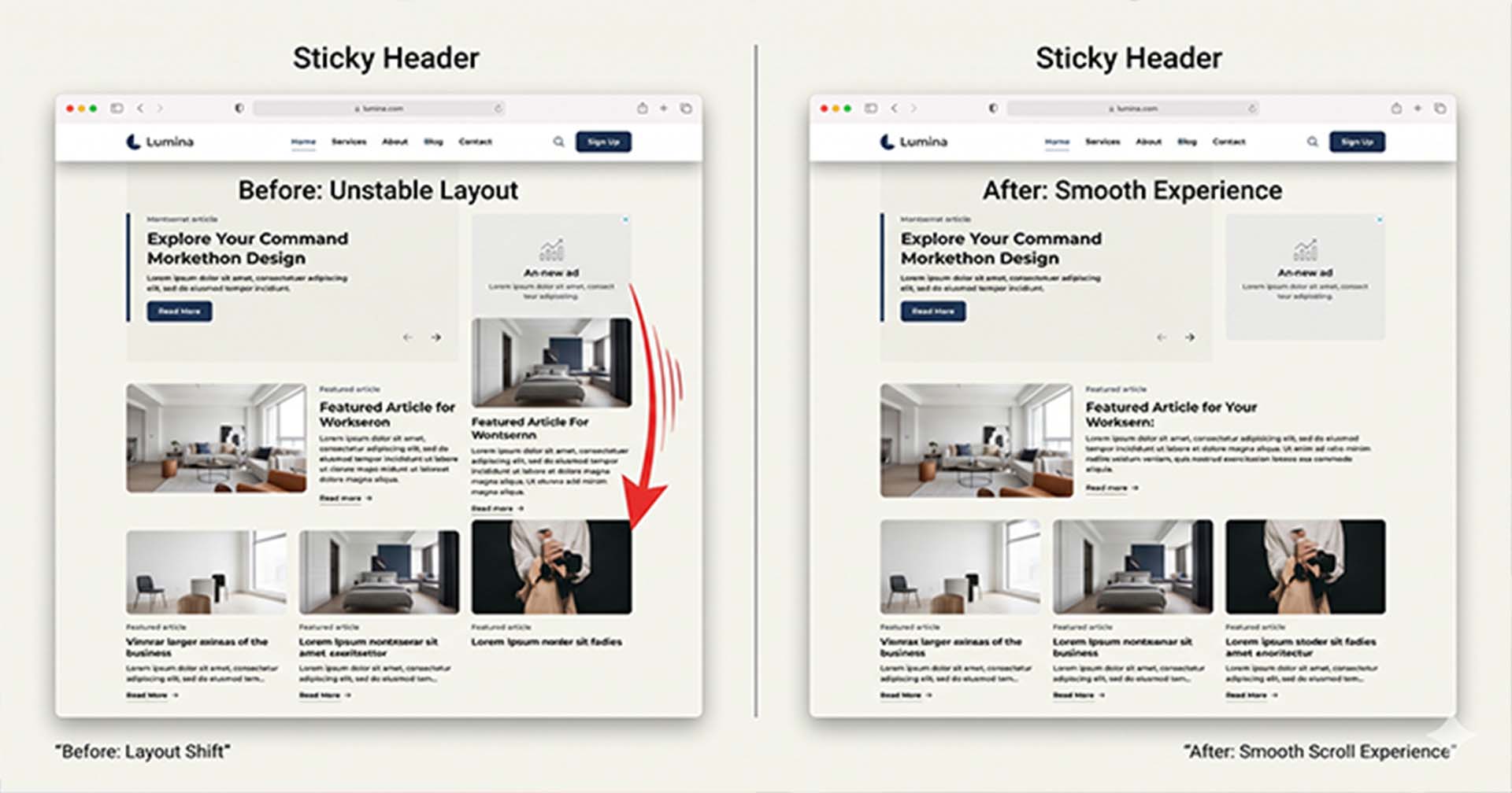

If you’ve ever noticed your website content slightly moving left or right when you start scrolling, you’re not alone. This subtle shift—often caused by sticky headers—is a common issue across many modern WordPress themes and custom-built websites.
While it may seem minor, it can negatively affect user experience and even make your site feel less polished.
What Causes the Layout Shift?
The most common reason behind this behavior is the scrollbar.
When a sticky header activates (usually when scrolling down), some themes unintentionally trigger changes in the page layout. This can cause the vertical scrollbar to appear or disappear, which slightly changes the width of the viewport.
As a result, the entire page content shifts horizontally.
Other contributing factors include:
- Using
width: 100vwinstead of100% - Adding
padding-rightdynamically via JavaScript - Switching header position from
statictofixed - Poorly optimized sticky header implementations
The Simple Fix (Works in Most Cases)
In most situations, you can solve this issue with a single CSS rule:
html {
  scrollbar-gutter: stable;
}
This tells the browser to always reserve space for the scrollbar, preventing layout shifts when it appears or disappears.
For better compatibility, you can also use:
html {
  overflow-y: scroll;
  scrollbar-gutter: stable;
}

body {
  overflow-x: hidden;
}
Important Tip for Developers
Avoid using: width: 100vw instead of 100%
Why? Because 100vw includes the scrollbar width, which can cause unexpected horizontal movement.
When the Problem Is Theme-Specific
In some cases, the issue comes from the theme itself—especially when:
- A sticky header adds/removes classes on scroll
- JavaScript modifies layout spacing dynamically
- The header switches to
position: fixed
In these scenarios, a custom fix may be required depending on the theme’s behavior.
Final Thoughts
This issue might look small, but fixing it makes your website feel significantly more professional and smooth.
At Hollands Web, we focus on these small details—because great user experience is built on precision.
If your website has similar issues, it’s often a sign that deeper performance and UX improvements can be made.