


A website can look impressive and still provide a poor user experience.
Smooth animations, modern typography, large images, gradients, and sophisticated layouts can make an interface attractive, but good UX is ultimately about helping users understand what they are seeing and complete what they came to do.
The strongest website designs combine visual quality with clarity, hierarchy, usability, and purpose. Here are five principles that help make that happen.
1. Motion Should Explain, Not Decorate
Animation can make an interface feel polished, but movement should have a reason to exist.
Useful motion can show that an action succeeded, reveal where an element came from, guide attention toward important information, or make the relationship between two interface states easier to understand.
A button changing after submission is useful. A menu smoothly revealing its options can improve orientation. An element moving simply because the user scrolled past it may add very little.
Too much animation can also introduce distraction, accessibility problems, and unnecessary performance costs.
The question should therefore be simple:
What is this animation helping the user understand?
If there is no clear answer, the interface may be better without it.
This section would work well with a short before-and-after video showing decorative animation versus purposeful micro-interaction.
2. Contrast Is Really About Priority
Contrast is often discussed as the difference between light and dark colors, but good interface contrast goes much further.
It tells users what matters first.
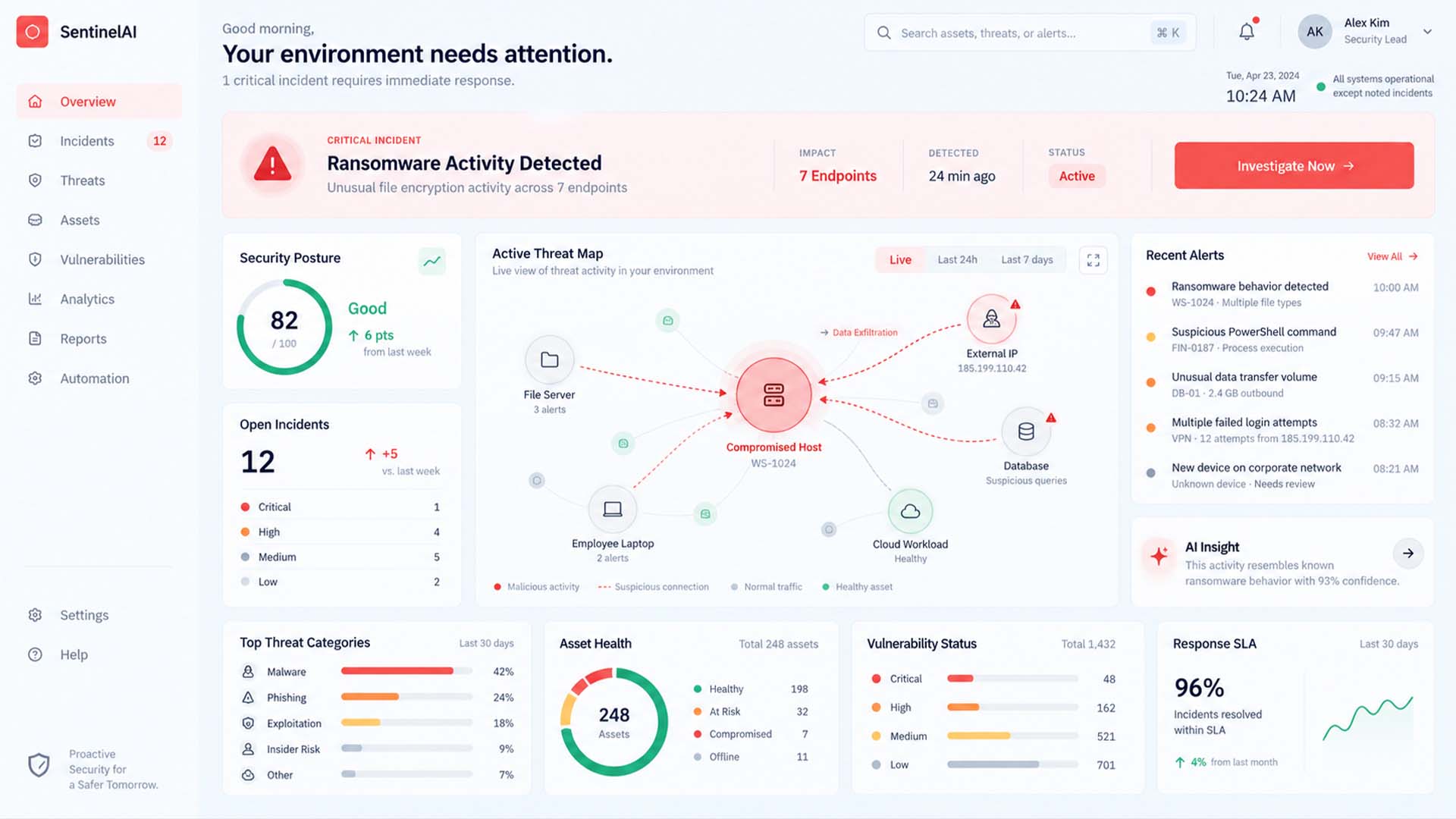
A strong page might use a large headline, smaller supporting copy, a visually dominant primary button, quieter secondary actions, and enough whitespace to separate different ideas.
The result is visual hierarchy.
When every heading is huge, every button is bright, and every section tries to attract attention, users no longer know where to look.
Good contrast therefore answers three questions almost instantly:
What is this page about?
What should I look at next?
What can I do here?
A strong interface does not make everything important. It makes importance visible.
3. Emotion Should Support the Purpose
Great websites do more than function correctly. They create an appropriate feeling.
Typography, spacing, photography, composition, motion, and color all influence how users perceive a website before they have read much of its content.
But emotion should match the product.
A luxury brand may benefit from generous whitespace and restrained visual elements. A financial service may need to communicate security and stability. An educational platform should usually prioritize clarity, credibility, and calm navigation.
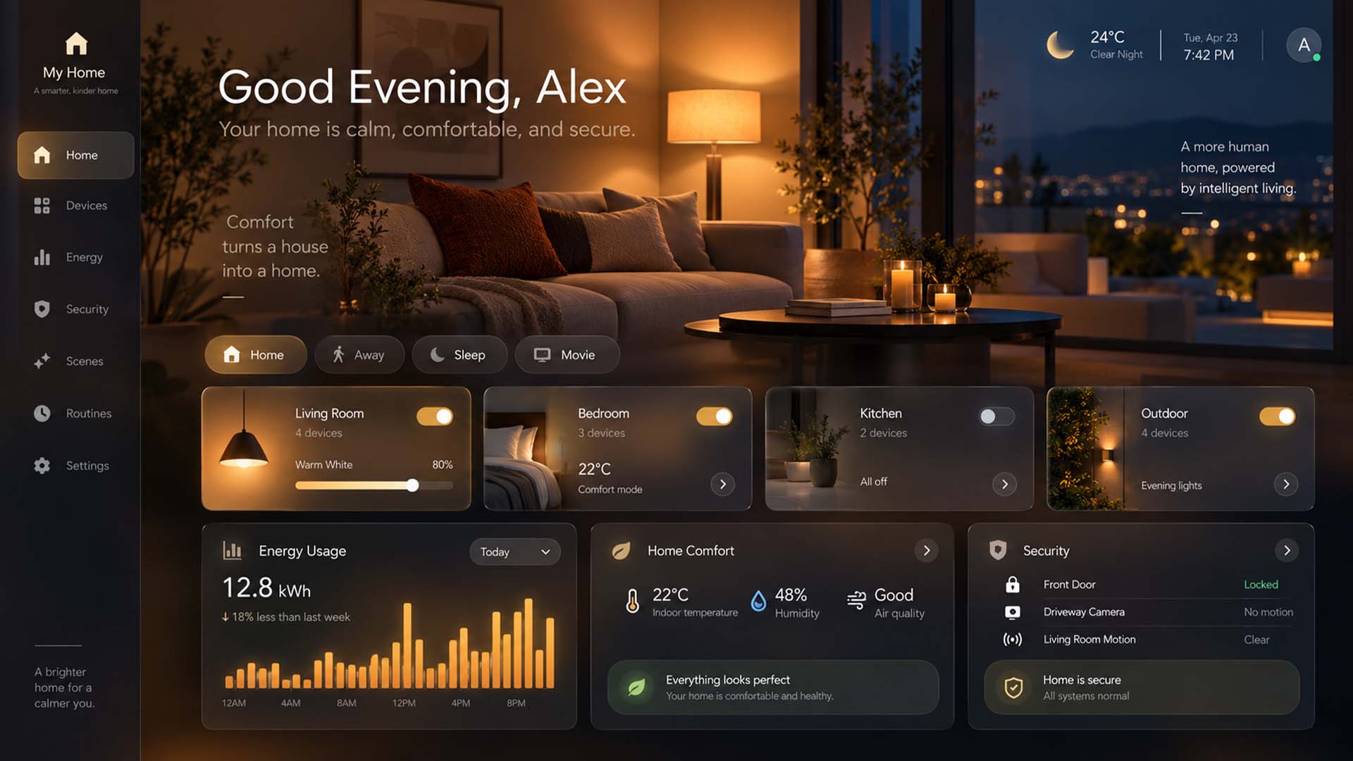
The goal is not simply to make a website feel exciting.
It is to make it feel right for what the website represents.
An interactive comparison between the same layout styled for luxury, technology, and education could demonstrate this principle visually.
4. Simplicity Requires More Work Than Complexity
Adding things to a design is easy.
Removing them is harder.
Good simplicity comes from repeatedly asking whether every section, button, icon, sentence, effect, or navigation option is helping the user.
This does not mean that every website should be minimalist.
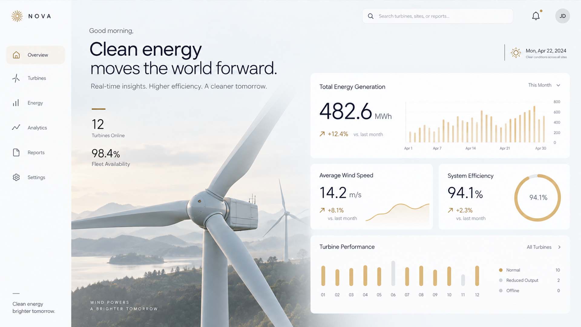
A complex platform may genuinely need dozens of features. The challenge is presenting that complexity without forcing users to process everything simultaneously.
This is why simplicity is better understood as reducing cognitive load, rather than simply reducing the number of elements on a screen.
The best interfaces often feel obvious because a considerable amount of complexity has already been resolved by the designer.
5. Start With User Intent
This is the principle that connects all the others.
Before deciding on animation, colors, typography, spacing, or visual style, ask:
What is the user trying to accomplish here?
Someone opening a product page may want to understand the product, compare it, check the price, and decide whether to buy.
Someone reading a technical article wants to find reliable information quickly.
Someone visiting a service website may simply want to understand what the company offers and whether it can be trusted.
The interface should be designed around that intent.
This is also why a visually beautiful website can still have bad UX. If navigation is confusing, information is difficult to find, important actions are hidden, or pages are slow, aesthetic quality cannot compensate for those problems.
Good UI Should Make Good UX Easier
The best web design is not a choice between beauty and usability.
It combines both.
Motion should explain. Contrast should establish priority. Emotion should reinforce the purpose of the website. Simplicity should reduce unnecessary cognitive effort.
But all of these decisions should begin with the same question:
Does this help the user understand something, trust something, decide something, or do something?
If the answer is no, the element probably deserves another look.
That principle is far more useful than following visual trends—and it is one of the clearest differences between a website that merely looks designed and one that actually feels well designed.