

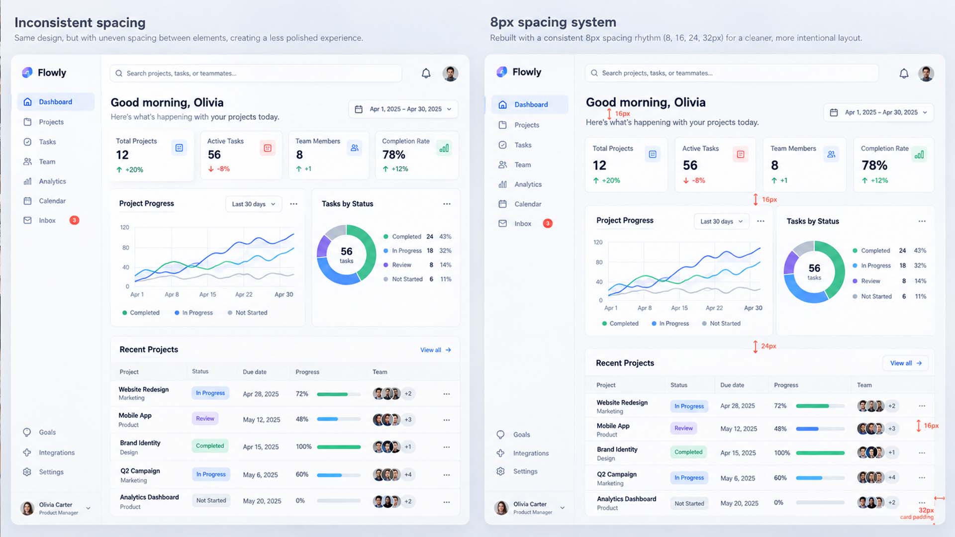

Why can two websites use similar fonts, colors, cards and buttons, yet one immediately feels more polished?
The difference is often not a sophisticated animation, expensive illustration or clever visual effect. It is something much quieter: spacing consistency.
Well-designed interfaces tend to repeat spatial decisions. Similar cards have similar padding. Related text stays predictably close together. Sections use a recognizable vertical rhythm. Buttons belonging to the same family share dimensions.
An interface without that discipline may still contain attractive individual elements, but the page can feel subtly unsettled.
The 8px spacing rule is one popular way to introduce that consistency. Instead of choosing a new margin or padding value every time, designers work from a limited spacing scale such as 8, 16, 24, 32 and 48 pixels, often using 4px for smaller relationships.
But 8px is not a magic number, and professional UI design is not created simply by making every measurement divisible by eight.
The real principle is more useful:
Professional interfaces tend to look intentional because the same design decisions are repeated consistently.
The Invisible Difference Between Amateur and Professional UI
Users rarely inspect a website and think, “That gap should have been 16px instead of 13px.”
They experience the accumulated result.
Imagine a pricing card where the icon sits 15px above the heading, the heading sits 11px above the description, the description has 27px before the price, and the button begins another 19px later.
None of those values is individually disastrous.
The problem is that they may have no obvious relationship to one another.
Move to the next card and perhaps the values change again. Then the form uses different spacing. The footer introduces another set of gaps. Eventually the page accumulates dozens of tiny decisions that do not seem to belong to the same visual language.
That creates visual noise.
A systematic interface behaves differently. The designer may decide that closely related elements use an 8px gap, ordinary content relationships use 16px, component padding uses 24px, and larger groups are separated by 32px.
The user never needs to know those numbers.
They simply see a page in which things appear to belong together.
Random Spacing Creates Visual Noise
Consider two sets of spacing values:
Unstructured approach
11px · 17px · 23px · 29px · 37px
Structured approach
8px · 16px · 24px · 32px · 40px
The second sequence tends to be easier to manage because every value belongs to a predictable scale.
That does not mean 17px is inherently ugly or 24px inherently beautiful.
A well-designed interface could deliberately use a different base unit, optical adjustment or fluid spacing formula. Mature design systems do not all use identical scales. IBM’s Carbon Design System, for example, includes spacing tokens at 2, 4, 8, 12, 16, 24, 32, 40px and beyond rather than limiting every relationship to strict multiples of eight.
The problem is therefore not “odd numbers.”
It is arbitrary decisions without a system.
A spacing scale reduces those decisions. Instead of asking, “What margin looks good here?” every time you design a component, you ask, “Which existing spacing relationship does this element need?”
That is a much stronger design question.
Professional Interfaces Repeat Decisions
One of the clearest signs of a mature interface is repetition—not repetition of content, but repetition of rules.
If three product cards are members of the same component family, they should normally share the same internal padding.
If primary buttons belong to the same size variant, their height and horizontal padding should remain consistent.
If several landing-page sections have comparable importance, their vertical rhythm should feel related rather than being independently improvised.
This is where spacing stops being decoration and starts becoming part of the system.
For example, a SaaS dashboard might establish:
- 8px between an icon and its label
- 16px between closely related content groups
- 24px internal card padding
- 32px between cards or larger component groups
- 64–96px between major page sections
Those exact values are not universal recommendations. A dense enterprise dashboard and a premium editorial landing page may require very different spacing densities.
What matters is that similar relationships receive similar treatment.
Once that happens, users can understand the interface with less visual effort. Components feel related because they behave according to the same underlying grammar.
What Is the 8px Spacing Rule?
The 8px spacing rule is a design convention in which many layout measurements are selected from increments based around eight pixels—for example 8, 16, 24, 32, 40, 48 and 64px.
It is commonly associated with the broader 8-point grid approach.
Earlier Material Design guidance from Google, for example, aligned many components to an 8dp baseline grid while using a smaller 4dp grid for typography and certain detailed alignment work. That is an example of a platform design system adopting an 8-based structure, not evidence that every website must do the same.
For web projects, the practical benefit is simple: an 8px-based scale gives designers and developers a small vocabulary of reusable measurements.
Instead of this:
13px, 18px, 21px, 27px, 31px, 43px...
you might primarily use:
8px, 16px, 24px, 32px, 48px, 64px...
This makes design decisions easier to repeat across cards, forms, navigation, landing pages and responsive states.
More importantly, the values can become spacing tokens rather than isolated pixel measurements.
For example:
space-xs → 8px
space-sm → 16px
space-md → 24px
space-lg → 32px
space-xl → 48px
Now a designer and frontend developer are talking about the same system instead of manually recreating visual measurements component by component.
Why 4px Still Matters in an 8px System
A strict 8px-only scale can sometimes be too coarse.
Imagine a label sitting above a form field. An 8px gap may feel appropriate, while 16px would separate the label too strongly from the field it describes.
Now consider an icon beside a small text label. Even 8px may occasionally create more separation than the component needs.
This is why many systems introduce 4px as a smaller subdivision.
You might use 4px for very tight internal relationships, 8px for closely related elements, 16–24px for component-level grouping, and substantially larger values for page structure.
The key is hierarchy.
Spacing should communicate relationships:
Smaller gap → stronger relationship
Larger gap → weaker relationship or new group
That is more important than whether every number is divisible by eight.
The spacing system should support the information architecture, not override it.
Before and After: A Card With No Spacing Logic
Consider a typical analytics card.
Before
The card contains an icon, heading, description, chart and action link.
The designer adjusts each gap visually:
Icon → heading: 13px
Heading → description: 11px
Description → chart: 27px
Chart → action: 19px
Card padding: 21px
The card may still look acceptable in isolation.
The trouble appears when five more cards are created and each one receives slightly different values.
After
The component is rebuilt around a small spacing vocabulary:
Card padding: 24px
Icon → heading: 16px
Heading → description: 8px
Description → chart: 24px
Chart → action: 24px
The improvement does not come from 24px being visually superior to 21px.
It comes from the fact that the card now has a repeatable internal rhythm.
Duplicate the component and the rule travels with it.
That is the difference between adjusting a design and designing a system.
Before and After: Forms Become Easier to Scan
Forms expose inconsistent spacing very quickly because they contain many repeating relationships.
A poorly structured form might have 10px between one label and field, 14px elsewhere, 21px between some field groups and 28px between others.
Each inconsistency is small. Together they weaken the form’s rhythm.
A cleaner system might define:
Label → input: 8px
Input → helper text: 4px
Field group → next field group: 24px
Form section → next section: 32px
Now the spacing itself helps communicate structure.
Labels stay visually attached to their controls. Helper messages remain connected to the field they explain. Separate questions receive more breathing room.
But spacing should never be confused with accessibility compliance.
For example, WCAG 2.2 Success Criterion 2.5.8 requires pointer targets to meet a minimum target-size condition of 24 × 24 CSS pixels or satisfy specified spacing or other exceptions. A visually elegant 8px grid does not automatically make controls accessible.
Button targets, focus states, keyboard operation, text readability and contrast still require separate attention.
Before and After: Landing Pages Need Rhythm, Not Repetition
Spacing systems become even more important at page level.
Suppose a landing page contains:
Hero
Social proof
Feature section
Product screenshot
Testimonials
Pricing
CTA
A common mistake is to treat each section independently.
One receives 83px of top padding. Another gets 112px. Another 67px. The hero uses 91px because it “looked about right.”
Again, none of those numbers is automatically wrong.
But without a reason for those differences, the page may lack rhythm.
A more deliberate system might establish a large desktop section token and then use variations based on hierarchy:
Major sections: 96px
Related subsections: 64px
Compact groups: 48px
On tablet those values might tighten, and on mobile they may become smaller again.
The important point is that responsive design should adapt the system, not simply preserve desktop spacing at every viewport.
A generous 96px gap that feels elegant on a wide monitor may consume too much of a phone screen.
Consistency does not mean identical measurements everywhere. It means predictable rules for how measurements change.
The 8px Rule Works Best as a Token System
The biggest improvement happens when spacing stops being a collection of numbers and becomes part of the design system.
Instead of manually remembering that cards use 24px padding, modals use 32px and major sections use 96px, define semantic or scale-based tokens.
Those tokens can exist in both the design file and frontend code.
A Figma component may use the same spacing vocabulary that the CSS, Sass, Tailwind configuration or design-token pipeline eventually implements.
That creates an important connection:
Design consistency is easier to maintain when designers and developers share the same source of decisions.
Without it, a design may begin systematically and gradually drift during implementation.
One developer uses 20px because the screenshot looked close enough. Another component receives 22px. A later revision introduces 18px.
After months of changes, the product may contain dozens of almost-identical spacing values.
Tokens make that drift easier to prevent and easier to audit.
Do Not Force Everything Onto the Grid
A good spacing system should reduce unnecessary decisions, not prevent designers from making necessary ones.
There are legitimate reasons to step outside a base scale.
Typography sometimes needs optical rather than mathematical alignment.
Logos and icons have different visible bounds even when their actual boxes are identical.
Complex data interfaces may require denser controls than a marketing site.
A component may need an unusual dimension to meet content, localization or accessibility requirements.
Fluid layouts may also use CSS functions such as clamp() rather than fixed pixel values for every section.
The useful question is not:
“Is this value divisible by eight?”
It is:
“Is there a clear reason this value differs from the system?”
If the answer is yes, the exception may be entirely justified.
If the answer is “it looked slightly better when I dragged it,” the design probably deserves another look.
Spacing Is Only One Part of Professional UI Design
Spacing can produce a surprisingly noticeable improvement, but it cannot rescue a weak interface by itself.
A polished website also depends on typography, alignment, contrast, hierarchy, color, imagery, component states and interaction behavior.
A page with perfect 8px increments can still fail if everything has the same visual importance.
A clean card system can still be difficult to use if text contrast is poor.
Beautiful whitespace does not compensate for ambiguous navigation.
A balanced form is not accessible if focus states disappear for keyboard users.
This is why spacing should be understood as one layer of a larger interface system.
Its advantage is that it is often one of the fastest layers to clean up.
A Quick Spacing Cleanup Before You Launch
You do not need to redesign an entire website to improve its spacing.
Start by scanning the interface for repeated patterns.
Check whether cards of the same type have the same padding. Compare buttons belonging to the same variant. Review the gap between form labels and controls. Look at the distance between headings and the content they introduce.
Then inspect the page at a larger scale.
Are similar sections using similar vertical spacing? Are unrelated groups clearly separated? Does mobile preserve the same hierarchy without carrying unnecessarily large desktop gaps?
Finally, look at the spacing values themselves.
If the design uses 7px, 9px, 11px, 13px, 14px, 17px, 18px, 21px, 22px and 23px for relationships that are essentially equivalent, you probably have an opportunity to simplify.
Do not mechanically round every value.
Reduce the number of unnecessary distinctions.
That is the real cleanup.
The Real Lesson Behind the 8px Spacing Rule
The 8px spacing rule is useful because it gives teams a simple starting structure.
But eight is not what makes an interface professional.
Consistency does.
A strong interface establishes a small number of spatial relationships, applies them repeatedly, adapts them deliberately across screen sizes, and documents exceptions when exceptions are necessary.
The next time a design feels almost right but somehow unfinished, do not immediately add another effect.
Inspect the gaps.
You may find that the fastest visual improvement is not adding anything at all—it is making the existing space behave like part of a system.
For a deeper look at how the system works across spacing scales, grids, components and responsive layouts, continue with The 8-Point Grid in UI Design: How to Create Cleaner, More Consistent Interfaces.
FAQ
Is the 8px spacing rule mandatory in UI design?
No. An 8px spacing system is a design convention, not an accessibility standard or universal UI rule. Other scales can work equally well when they are applied consistently and suit the product.
Should every margin and padding value be a multiple of 8?
No. Many systems use smaller increments such as 4px, and some include values such as 12px. Optical alignment, typography, responsive layouts and specific component requirements can also justify exceptions.
Why do designers use 4px with an 8px grid?
A 4px subdivision gives designers more control over tight relationships where the jump from 8px to 16px is too large. It is especially useful inside compact components and between closely related content.
Does using an 8px grid automatically improve UX?
No. It can improve visual consistency and maintainability, but UX also depends on information architecture, usability, accessibility, content, hierarchy, interaction design and many other factors.
Should spacing become smaller on mobile?
Often, but not universally. Large section spacing frequently needs to become more compact on smaller screens, while interactive controls still need adequate size and separation. Responsive spacing should preserve hierarchy rather than simply scale every desktop value proportionally.