
No products in the cart.

Flexbox, short for Flexible Box Layout, is a <strong><a href="https://webyildiz.com/blog/tag/css/">CSS</a> </strong>(Cascading Style Sheets) layout model that provides an efficient way to create flexible and responsive web page layouts. It is designed to simplify the arrangement and alignment of elements within a container, making it easier to create complex and dynamic layouts.With the Flexbox layout model, the elements within a container can flexibly adjust their size, order, and alignment to accommodate different screen sizes and content variations. The layout is based on a flex container and flex items.
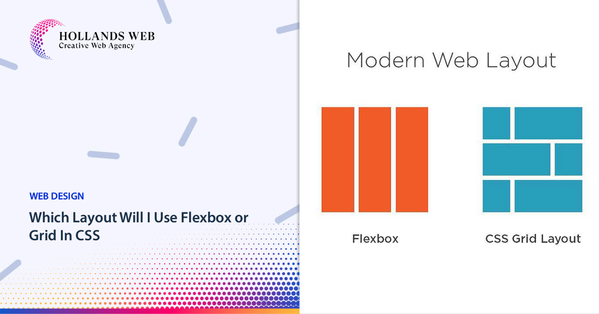
Flexbox and Grid are both CSS layout modules that allow developers to create flexible and responsive website layouts, bu...
 Web Hosting
 Web Designs
 Graphic Design
 SEO
SEO Digital Marketing