
No products in the cart.

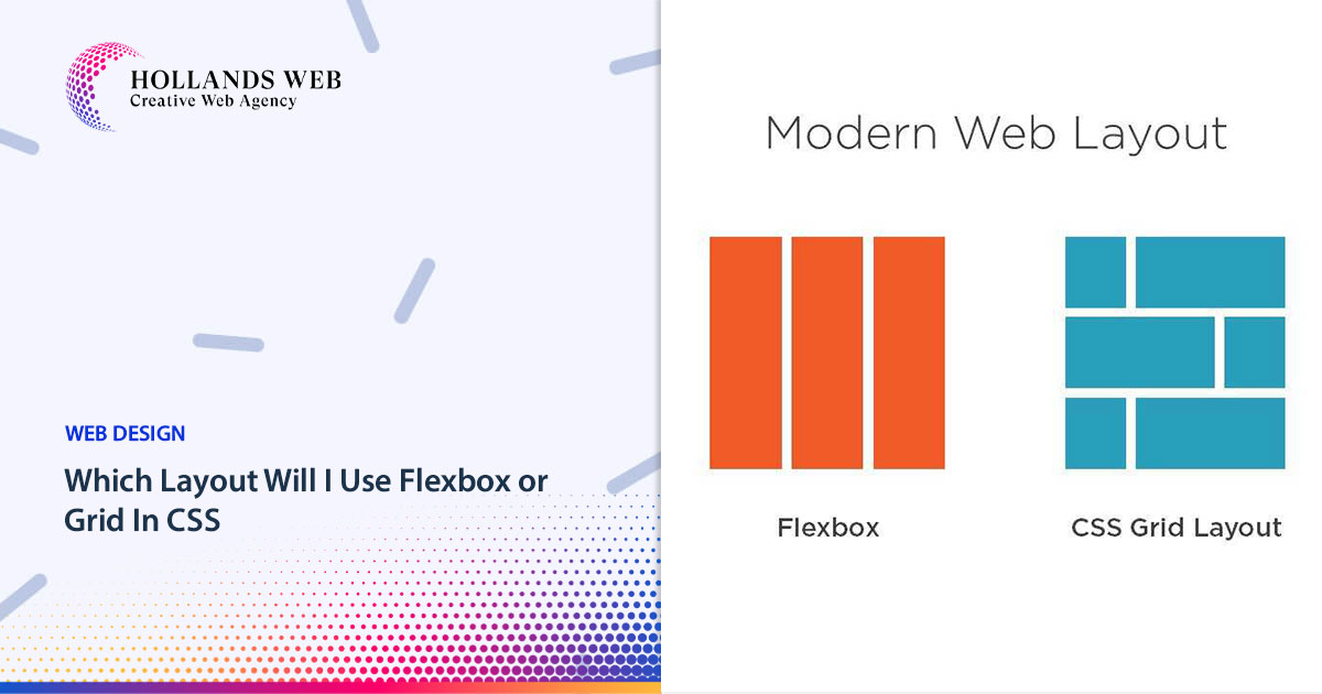
Flexbox and Grid are both CSS layout modules that allow developers to create flexible and responsive website layouts, but they have different use cases and approaches. Let’s explore each of them in more detail:
Flexbox Layout:
Flexbox, short for Flexible Box Layout, is designed for one-dimensional layouts, typically for arranging items in a single row or column. It excels at creating flexible and dynamic responsive website layouts, especially for components like navigation menus, lists, and card-based designs.
Key features of Flexbox include:
- One-dimensional layout: Flexbox operates along either the horizontal (row) or vertical (column) axis.
- Flex containers and flex items: Flexbox uses a parent-child relationship, where the container (displayed using
display: flex;) holds the flex items. - Main and cross axis: Flexbox has a main axis and a cross axis. The main axis corresponds to the direction defined by the flex container (row or column), while the cross axis is perpendicular to it.
- Flexibility: Flexbox offers powerful features like flexible box sizing, order control, alignment, and distribution of flex items.
- Responsive behavior: Flexbox adjusts its layout automatically based on available space, making it suitable for responsive designs.
Flexbox Layout Example:
html
<div class="container">

<div class="item">1</div>

<div class="item">2</div>

<div class="item">3</div>

</div>
css
.container {

display: flex;

justify-content: space-between;

}.item {

flex: 1;

text-align: center;

padding: 20px;

background-color: lightblue;

border: 1px solid blue;

}
In this Flexbox layout example, we have a container with three items. By setting the container’s display property to “flex,” we create a horizontal row layout. The justify-content: space-between; property distributes the items with equal space between them, creating a responsive row of items.
Grid Layout:
CSS Grid Layout, often referred to as just Grid, is a two-dimensional layout system that allows you to define complex grid structures. It is ideal for creating grid-based designs, such as magazine-style layouts, image galleries, and overall page structures.
Key features of Grid include:
- Two-dimensional layout: Grid enables the creation of grid systems that can handle rows and columns simultaneously.
- Grid containers and grid items: Similar to Flexbox, Grid also operates on a parent-child relationship, where the container (displayed using
display: grid;) holds the grid items. - Explicit grid: Grid allows you to define explicit rows and columns, specifying their size, alignment, and spacing.
- Grid tracks and gutters: You can define the size of rows and columns using fixed lengths, percentages, or flexible units. Additionally, you can control the spacing between them.
- Grid placement: Grid offers precise control over item placement within the grid using line-based positioning, spanning multiple cells, and alignment properties.
- Responsive behavior: Grid enables responsive layouts through media queries and allows you to rearrange and resize grid items as the viewport changes.
Grid Layout Example:
html
<div class="grid">

<div class="item">1</div>

<div class="item">2</div>

<div class="item">3</div>

<div class="item">4</div>

<div class="item">5</div>

<div class="item">6</div>

</div>
css
.grid {

display: grid;

grid-template-columns: repeat(3, 1fr);

grid-gap: 10px;

}.item {

text-align: center;

padding: 20px;

background-color: lightblue;

border: 1px solid blue;

}
In this grid layout example, we have a container with six items. By setting the container’s display property to “grid” and using grid-template-columns with repeat(3, 1fr), we create a grid layout with three equal-width columns. The grid-gap property adds spacing between the items.
Here’s another example using Grid for a more complex layout:
html
<div class="grid">

<div class="header">Header</div>

<div class="sidebar">Sidebar</div>

<div class="main">Main Content</div>

<div class="footer">Footer</div>

</div>
css
.grid {
display: grid;
grid-template-areas:
"header header"
"sidebar main"
"footer footer";
grid-template-columns: 200px 1fr;
grid-template-rows: auto 1fr auto;
grid-gap: 10px;
}.header {
grid-area: header;
background-color: lightblue;
padding: 10px;
}
.sidebar {
grid-area: sidebar;
background-color: lightgreen;
padding: 10px;
}
.main {
grid-area: main;
background-color: lightgray;
padding: 10px;
}
.footer {
grid-area: footer;
background-color: lightcoral;
padding: 10px;
}
In this example, we use named grid areas to create a grid-based page layout with a header, sidebar, main content area, and footer.
When to use Flexbox or Grid:
While Flexbox and Grid can sometimes achieve similar layouts, they have different strengths and purposes. Here are some general guidelines for when to use each:
Use Flexbox when:
- You need to create one-dimensional layouts (row or column).
- You want to distribute items evenly along a single axis.
- You want to reorder items visually without modifying the source order.
- You need flexibility in expanding or shrinking items based on available space.
- You want to align items vertically or horizontally within a container.
Use Grid when:
- You need to create two-dimensional layouts (rows and columns).
- You want to establish complex grid structures with precise control over placement.
- You need to align items both vertically and horizontally.
- You want to create consistent gutters and spacing between elements.
- You require a responsive grid system that adapts to different screen sizes.
In practice, you can also combine Flexbox and Grid, using them together to leverage their respective strengths and create sophisticated layouts. Overall, both Flexbox and Grid are powerful CSS layout tools, and choosing between them depends on the specific layout requirements of your project.
In this tutorial, We have learned what is Flexbox layout and Grid layout. And What is the difference between them? And When to use Flexbox or Grid layouts.
You may also like
Table of Contents Toggle How to Copy Text to the Clipboard with JavaScriptHTML:JavaScript (script.js):How to Copy Multip...

Table of Contents Toggle Insist on user-centricUnderstand user personalities and internal stakeholdersFocus on content w...
Table of Contents Toggle Step 1 — Add site in CloudflareWhat are the most common types of DNS records?Step 2 — Update na...
Table of Contents Toggle What are URLs?How long should a URL be?Browser URL length restrictionsIs there anything else I ...
 Web Hosting
 Web Designs
 Graphic Design
 SEO
SEO Digital Marketing