
No products in the cart.

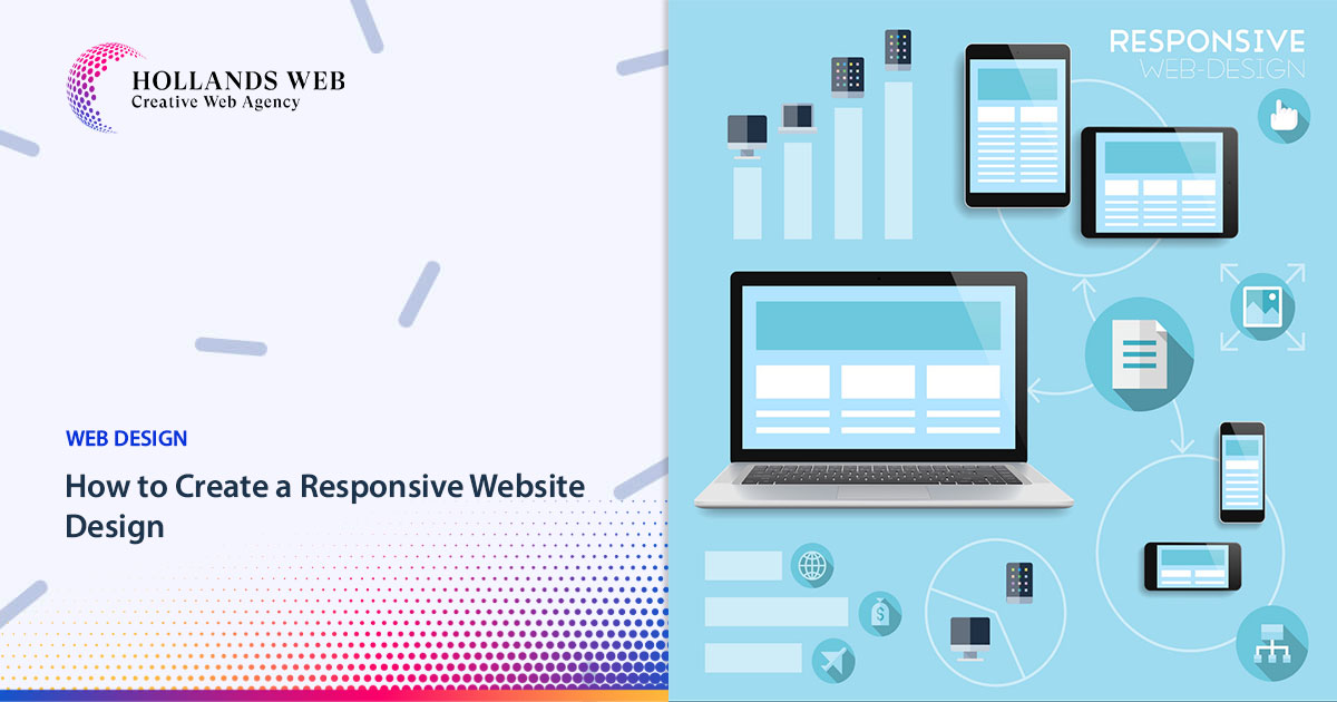
Creating a responsive website design involves designing your website so that it adapts and looks good on a variety of devices and screen sizes, including desktops, tablets, and smartphones. Here are the 9 steps and some examples of responsive Website Design techniques:
Use a Mobile-First Approach:
Start by designing for mobile devices and gradually add complexity for larger screens. This ensures a better user experience for mobile users.
Fluid Grid Layout:
Use a fluid grid system like CSS Grid or Bootstrap’s grid system to create a layout that adjusts to the screen size. Here’s an example of a simple grid structure:
html<div class="container">
<div class="row">
<div class="col-xs-12 col-sm-6 col-md-4 col-lg-3">
<!-- Content goes here -->
</div>
</div>
</div>
Flexible Images and Media:
Use CSS to make images and media elements scale with the container. This prevents images from overflowing or being too small. Here’s an example of CSS for responsive images:
cssimg {
max-width: 100%;
height: auto;
}
Media Queries:
Use media queries to apply different styles based on screen size. For instance, you can change font sizes, hide or show elements, or adjust spacing. Here’s an example of a media query:
css@media (min-width: 768px) {
/* Styles for screens wider than 768px */
}
Responsive Navigation:
Create a mobile-friendly navigation menu, such as a hamburger menu that expands when clicked on smaller screens. Here’s an example of a simple HTML structure for a responsive navigation menu:
html<div class="mobile-menu">
<button class="menu-toggle"></button>
<ul class="menu">
<li><a href="#">Home</a></li>
<li><a href="#">About</a></li>
<!-- Add more menu items -->
</ul>
</div>
Testing and Debugging:
Test your design on various devices and browsers to ensure it looks and functions as expected. Use browser developer tools to debug any issues.
Content Priority:
Prioritize the most important content for mobile users. Ensure that essential information is accessible and readable on small screens.
Performance Optimization:
Optimize images and other assets to reduce page load times, which is crucial for a good user experience on mobile devices.
Use CSS Flexbox and CSS Grid:
CSS Flexbox and Grid Layout are powerful tools for creating responsive designs. They allow you to create complex, flexible layouts without resorting to float-based or table-based layouts.
Here are a couple of examples of responsive web design:
Example 1: Responsive Images
html
<img src="image.jpg" alt="Responsive Image" class="img-responsive">
css
.img-responsive {

max-width: 100%;

height: auto;

}
Example 2: Media Queries
css
@media (max-width: 768px) {

/* Styles for screens up to 768px wide */

}/* Styles for screens between 769px and 1024px wide */
}
/* Styles for screens wider than 1024px */
}
Example 3: Responsive Typography:
Adjust font sizes and line spacing based on screen size to enhance readability. Here’s an example:
css
body {

font-size: 16px;

}body {
font-size: 14px;
}
}
Example 4: Fluid Video Embeds:
Ensure that embedded videos resize appropriately by using responsive embed codes provided by platforms like YouTube and Vimeo. Here’s an example:
html
<iframe width="560" height="315" src="https://www.youtube.com/embed/your-video-id" frameborder="0" allowfullscreen></iframe>
Example 5: Flexbox for Navigation:
Create a flexible navigation menu using CSS Flexbox. This allows you to adjust the layout of navigation links as the screen size changes.
html
<nav class="flex-nav">

<a href="#">Home</a>

<a href="#">About</a>

<!-- Add more links -->

</nav>
css
.flex-nav {

display: flex;

flex-direction: column; /* For mobile */

}.flex-nav {
flex-direction: row; /* For larger screens */
}
}
Example 6: Responsive Images with Different Resolutions:
Use the <picture> element to serve different image resolutions based on screen size and device capabilities:
html
<picture>

<source srcset="image-large.jpg" media="(min-width: 1200px)">

<source srcset="image-medium.jpg" media="(min-width: 768px)">

<img src="image-small.jpg" alt="Responsive Image">

</picture>
Example 7: Responsive Tables:
Creating responsive tables can be a bit challenging, especially when dealing with a lot of data. Here’s an example of how you can create a responsive table that works well on smaller screens by allowing horizontal scrolling:
HTML:
html
<div class="table-container">

<table>

<thead>

<tr>

<th>Header 1</th>

<th>Header 2</th>

<th>Header 3</th>

<!-- Add more headers as needed -->

</tr>

</thead>

<tbody>

<tr>

<td>Data 1</td>

<td>Data 2</td>

<td>Data 3</td>

<!-- Add more data cells as needed -->

</tr>

<!-- Add more rows as needed -->

</tbody>

</table>

</div>
CSS:
css
.table-container {

overflow-x: auto; /* Enable horizontal scrolling for the table on small screens */

}width: 100%;
border-collapse: collapse;
}
border: 1px solid #ccc;
padding: 8px;
text-align: left;
}/* Add some additional styling to improve readability */
th {
background-color: #f2f2f2;
}
background-color: #f2f2f2;
}
In this example, the table is wrapped in a container div with a class of “table-container.” This container has the CSS property overflow-x: auto;, which enables horizontal scrolling for the table on small screens.
Inside the table, there’s a media query for screens with a maximum width of 768px (adjust this breakpoint as needed). In this media query, the table cells (th and td) are set to display: block;, which causes them to stack on top of each other, making the table more readable on small screens.
Additionally, some styling is applied to the table headers (th) and alternating rows to improve readability. You can further customize the styles to match your design requirements.
This responsive table example ensures that the table is accessible and user-friendly on both small and large screens, allowing users to scroll horizontally when needed to view all the table data.
Example 8: Reordering Content with CSS Grid:
You can use CSS Grid to change the order of content on the page based on screen size. For example, you might want to move a sidebar below the main content on smaller screens.
css
.container {

display: grid;

grid-template-columns: 1fr 1fr;

}.container {
grid-template-columns: 1fr;
}
}
Example 9: Responsive Images for Backgrounds:
When using background images, make sure they scale and crop appropriately with the screen size. Here’s an example:
css
.hero-section {

background: url('background-image.jpg') no-repeat center center;

background-size: cover;

}
Remember that responsive website design is an ongoing process. As new devices with varying screen sizes and resolutions emerge, you may need to adapt and refine your design to ensure a seamless user experience across all platforms.
You may also like
Table of Contents Toggle 1. Search Engine Optimization2. Security3. Expansion and customization capabilities4. Content m...

Table of Contents Toggle VerificationSearch AppearanceSearch TrafficIndex CoverageSitemapsMobile UsabilitySecurity Issue...

Table of Contents Toggle Types of MonitorsGeneral Use & BusinessProfessional (Graphic Design, Photo & Video)Gami...

Table of Contents Toggle Branding adds valueBranding is influentialUse consistency to drive salesCreate competitive diff...
 Web Hosting
 Web Designs
 Graphic Design
 SEO
SEO Digital Marketing